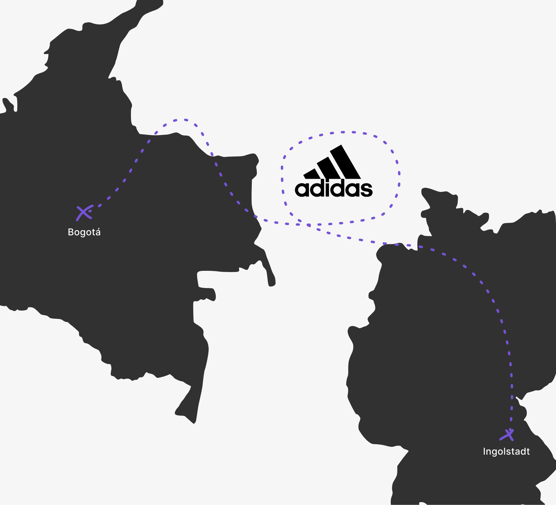
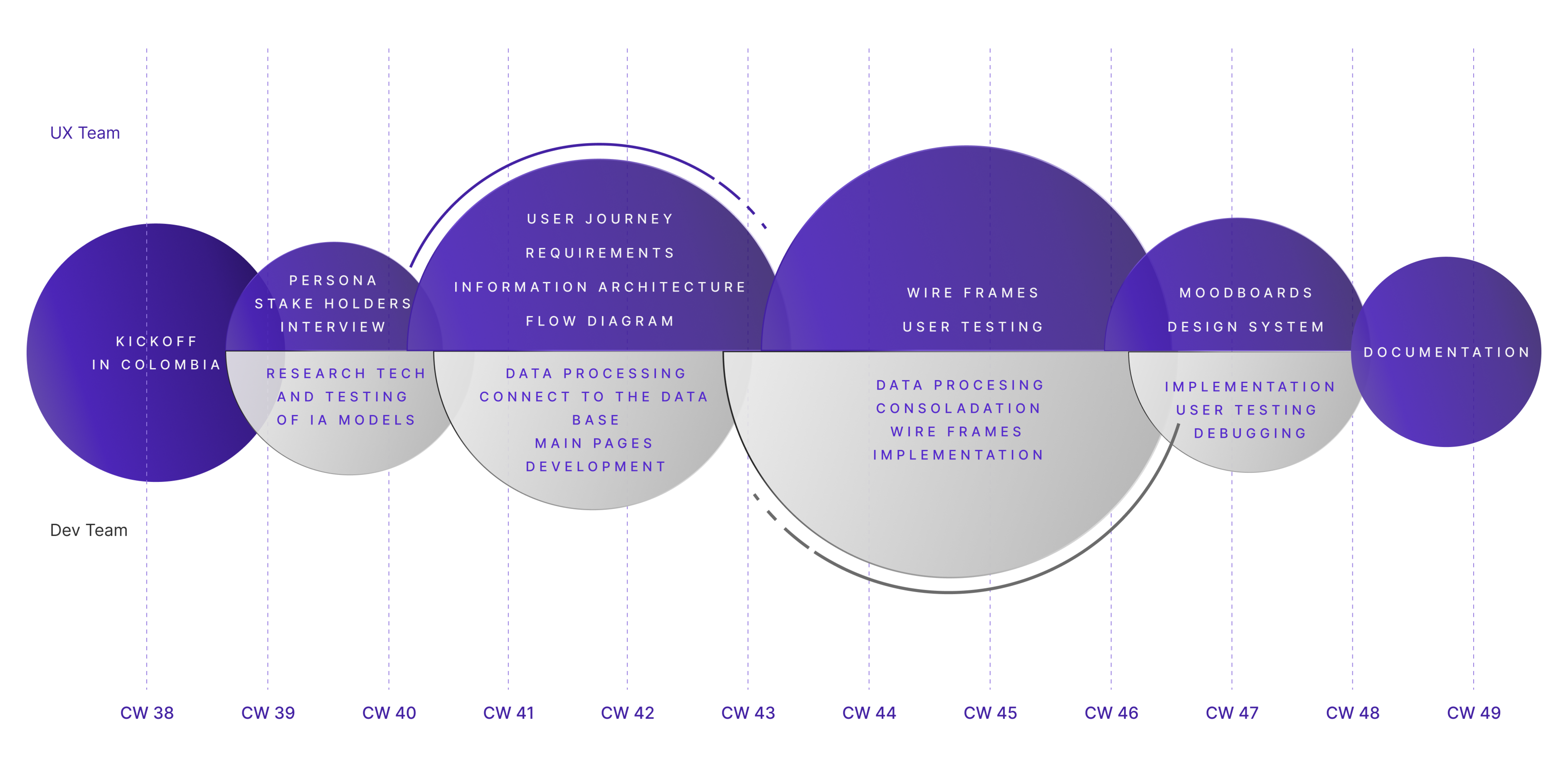
LookLab

A web-based tool for adidas that streamlines and speeds up the creation and management of in-store mannequin displays through virtual outfit planning.

My roles
UX/UI Design
Product Design
Project Management
Tools
  • Figma
  • Adobe Photoshop
    Adobe Illustrator
Context & Team
  • University
  • 6 Designer
    5 Developer
timeline
  • Sep 2025 - Dec 2025
    (4 Months)
overview

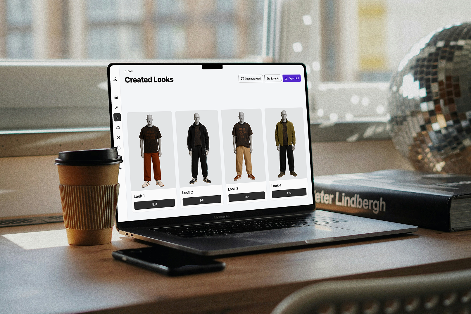
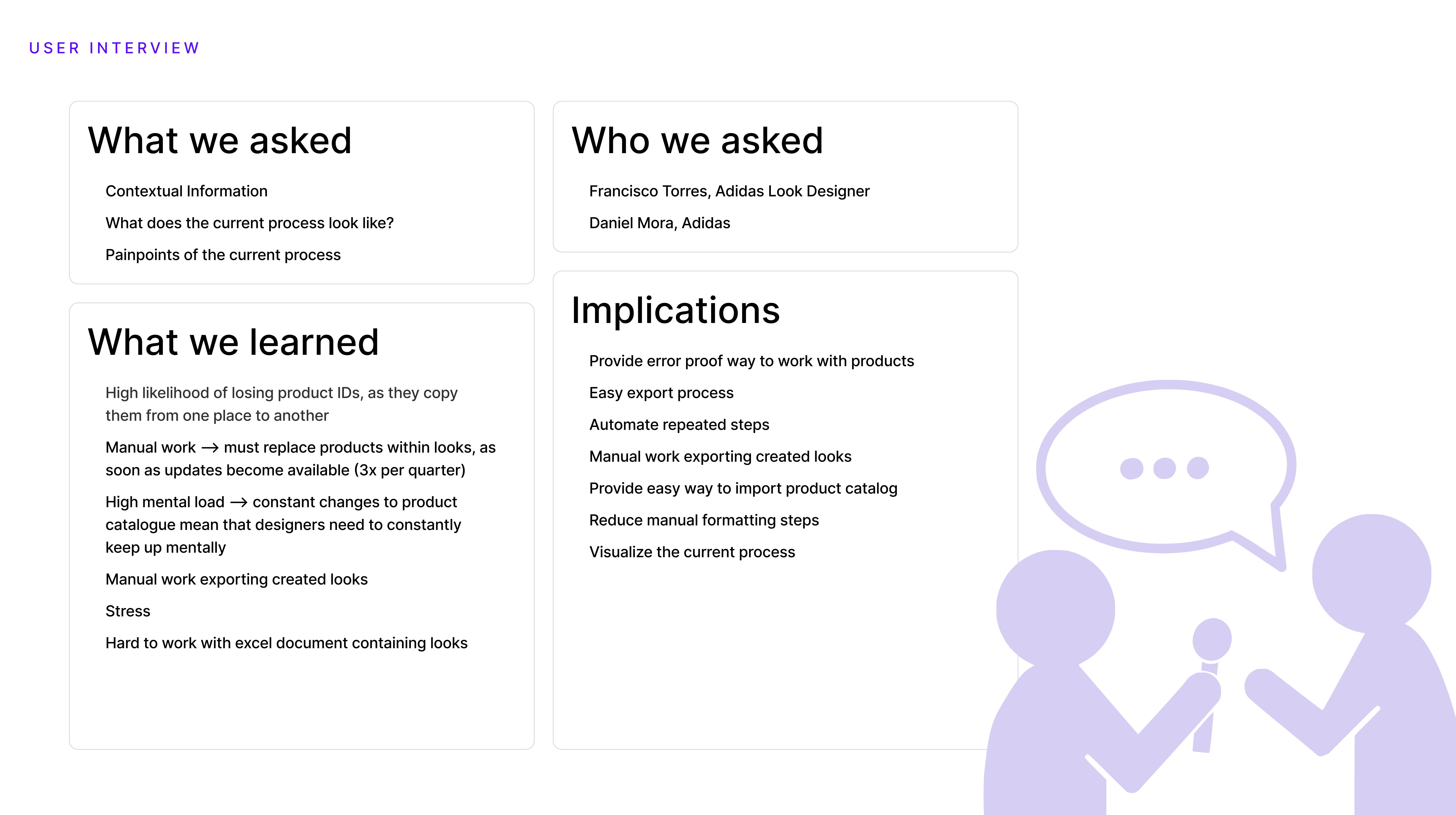
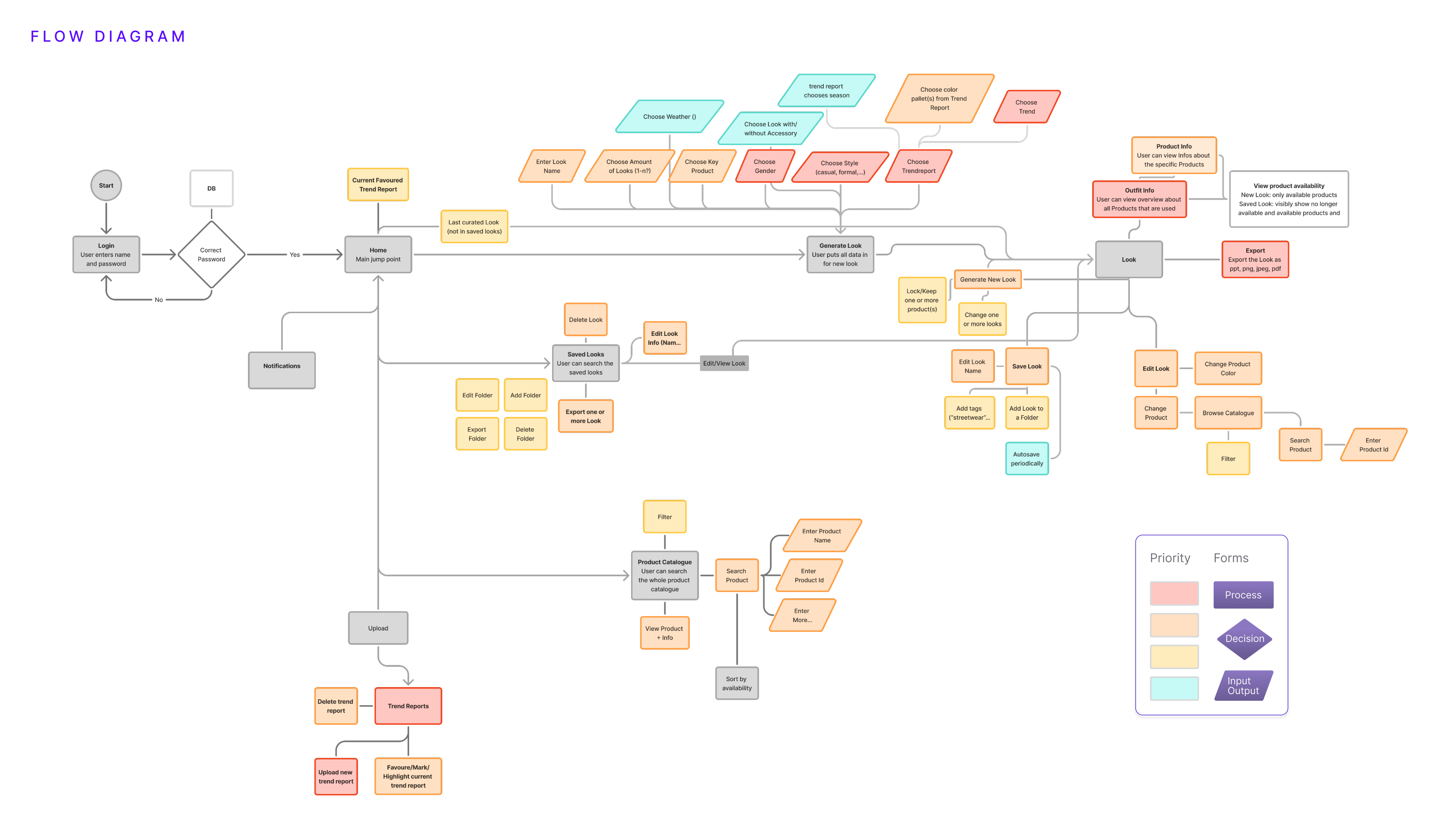
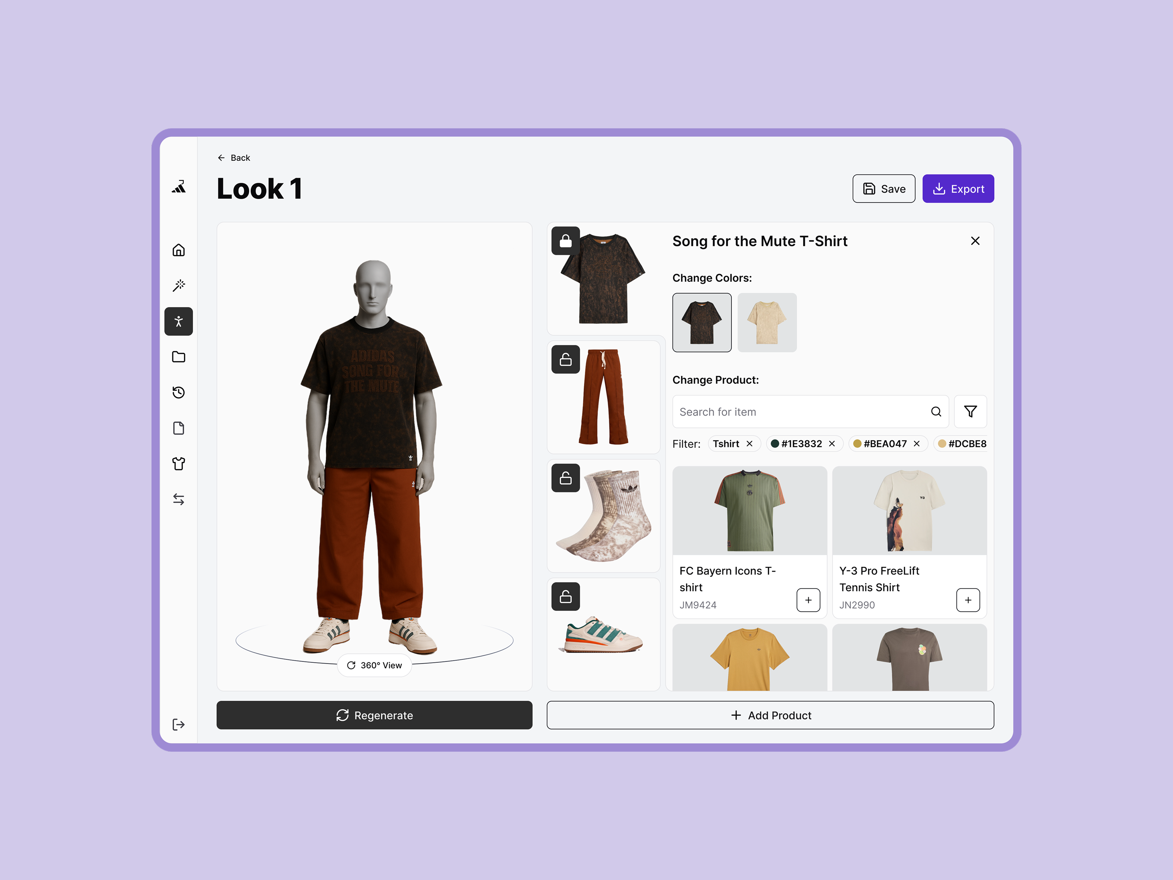
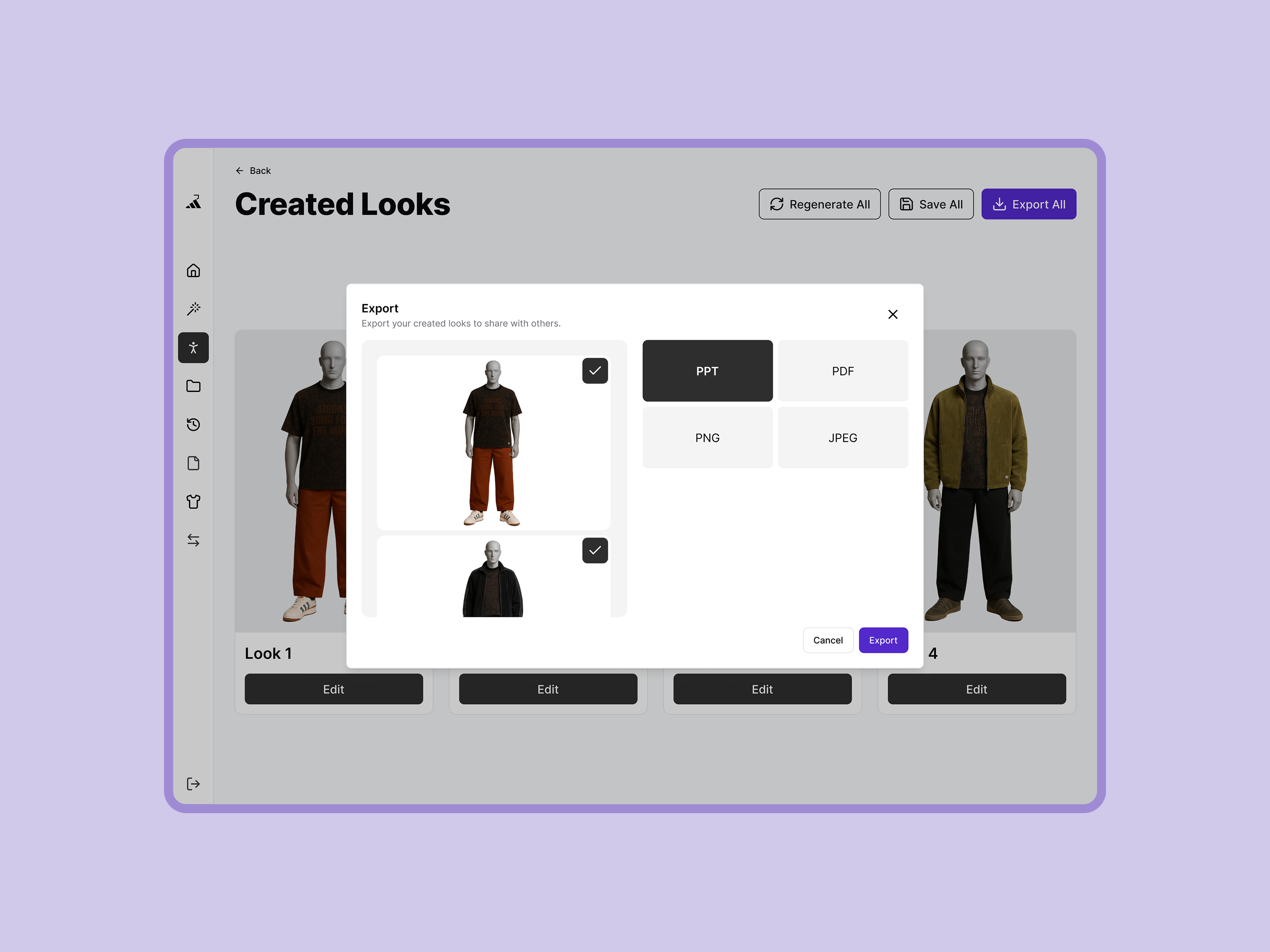
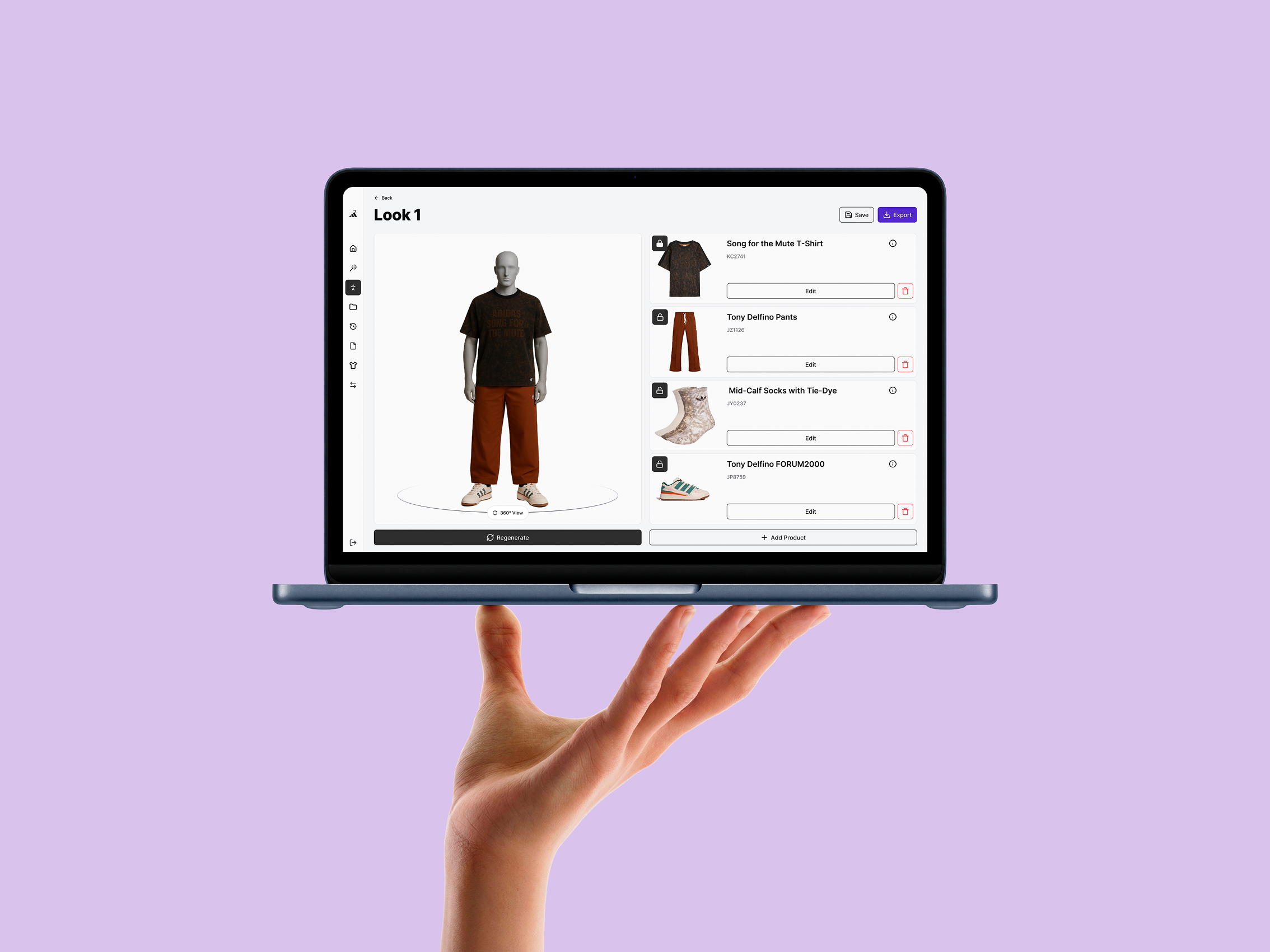
LookLab is a web based solution created to optimize the visual merchandising process for adidas, specifically for creating and managing "Shop the Look" concepts for in-store mannequin displays. It allows teams to virtually curate outfits and plan mannequin displays to ensure they always reflect the latest seasonal trends and available stock. By connecting creative styling with real-time data, LookLab makes the planning process more efficient, scalable, and professional.

The project was part of a university initiative in collaboration with UMNG (Universidad Militar Nueva Granada) for adidas Bogotá. It aimed to strengthen ties between Colombia and Germany through the exchange of knowledge and professional collaboration. while we students worked remote closely together.
My Contributions
  • UX Strategy: I worked on defining a logical structure and intuitive user flows to ensure a seamless navigation experience and maximum clarity.
  • Team Coordination: I managed task distribution and team synergy within the design team.
  • User Research: I assisted in crafting interview guides and preparing usability tests to gather actionable insights.
  • Design Execution: I bridged the gap between low-fi wireframes and high-fidelity UI, taking responsibility for the full UX/UI lifecycle and visual design.
The Problem
The process for visual merchandisers at adidas Mexico the "Shop the Look" process for in-store mannequins was managed through fragmented, manual workflows. Designers were forced to juggle creative styling with error-prone Excel sheets, manually tracking IDs and stock levels. This created a high mental load and left no room for scalable creativity.

Process

The development ran for 12 weeks, split across two teams: five people on the development side and six on UX/UI.
Both teams followed an iterative workflow, syncing weekly across continents and keeping close enough to stay aligned and support each other throughout.

Defining

Next, we conducted a detailed requirements analysis, translating user insights into actionable features. By applying the MoSCoW method, we prioritized these requirements to establish a clear roadmap, ensuring that both design and development focused on the high-impact 'Must-haves' that were critical for the MVP.

All requirements were directly integrated into the Information Architecture and User Flows to create a seamless, logical structure. This provided a solid foundation for a fully functional program, while the development team also simultaneously prepared the backend infrastructure.

Ideation & Iteration

We developed wireframes and validated them through usability testing to ensure our proposed logic was intuitive. These insights allowed the development team to begin building layouts and verify which planned features were technically feasible. By identifying where the design aligned with the backend and where adjustments were needed due to technical constraints, this collaborative loop enabled us to make precise refinements before moving into high-fidelity design.

We iterated on our color palette after realizing that our primary orange was too close to the system's alert/destruction red. To ensure a clearer visual hierarchy and match our envisioned mood board, we transitioned to a deep purple. This change provided a more professional feel and improved the overall user guidance.
To ensure the product's success, a final usability test was conducted on the MVP with the actual end-users. This allowed us to verify core features and refine the user journey based on real-world performance. Integrating this final feedback enabled us to eliminate the last remaining friction points, ensuring the tool was perfectly tailored to the team’s daily workflows and needs.

Solution

We delivered an MVP that enables the Visual Merchandising team to generate 'Key Looks' instantly.
Disclaimer: For IP protection, images show the design prototype and not the MVP.
By aligning user-defined parameters with trend reports and real-time stock, the tool automates a previously manual process. With integrated features to save, edit, and export, the team can now refine and share looks seamlessly, transforming their entire digital workflow.

Reflection

This project proved that communication is the actual work rather than just a side skill. Working across time zones taught me to be clear fast because anything vague simply breaks. By testing with real users early we stayed grounded in reality and fixed friction before it got out of hand. I also learned when to push my own ideas and when to embrace a sharper perspective from a teammate.
The best part was the intercultural exchange that happened naturally along the way. We did more than just design because we shared our cultures and built real friendships. Every decision needed a solid reason which made stakeholder talks smoother and kept things buildable for developers. In the end I realized that the best products come from genuine human connection and a team that stays truthful no matter what.
VIEW PROJECT